Apr 30, 2009

3D Design Visualization Seminar


(click image to enlarge..)

posted by afterrabbit

Sir Peter Cook Lecture Tour - KL


(click image to enlarge..)

posted by afterrabbit

Apr 27, 2009

12 Reasons to refuse to Render!


Marc Joseph, from Young Architect, has written a post about one of those tasks you should try to avoid at all cost in order to make your life easier: 3D Rendering. He wrote down 12 reasons why you should avoid rendering in your office:

1. You Will Lose Track of Time

2. More Demands on Your Time

3. The Employer Doesn’t Have Knowledge of the Software

4. You Will Find Yourself Re-doing Things Over and Over

5. You Have to Sweat the Details

6. You Are On Your Own: No One Else Can Help You

7. You May Have Knowledge in One Software But Not Another

8. You Lose Your Personal Space

9. You Won’t Be Working on Important Tasks

10. You Will Learn Less

11. You Will Be Under-appreciated

12. Professionals Do It Better

(to find out more..)

images & passage from:
http://www.archdaily.com/19360/12-reasons-to-refuse-to-render/#more-19360


posted by midori mizu

Apr 20, 2009

Thinking Architecture

"I believe that architecture today needs to reflect on the tasks and possibilities which are inherently its own. Architecture is not a vehicle or a symbol for things that do not belong to its essence. In a society that celebrates the inessential, architecture can put up a resistance, counteract the waste of forms and meanings, and speak its own language. I believe that the language of architecture is not a question of a specific style. Every building is built for a specific use in a specific place and for a specific society. My buildings try to answer the questions that emerge from these simple facts as precisely and critically as they can."

Thinking Architecture
Peter Zumthor, Swiss architect and winner of the 2009 Pritzker Prize

passage from:
http://architect-studio.blogspot.com/2009/04/thinking-architecture-peter-zumthor.html


posted by midori mizu

Apr 19, 2009

Ex Fonderie Riunite, Modena

A team of Italian architects comprising Modostudio, CCDP and Studio Cattinari have won first prize in a competition to regenerate a former industrial area in Modena, Italy, into a mixed-use public space.

Called ‘Ex Fonderie Riunite’, the project focuses around the conversion of a former metal-smelting complex into the new site for DAST, the centre for design, art, science and technology in the city.

The new buildings will be clad in perforated gold metal, which the architects claim will evoke the past use of the existing buildings.

‘The competition brief was the regeneration of an urban area called Ex Fonderie Riunite, a strategic area for the city of Modena with important historical value. The basic idea was the recovery of a former industrial building and a new detailed urban plan in the other areas of the competition.

Our proposal for this existing industrial complex, characterized by historically protected office buildings, was to keep the identity as a symbol for the history of the Italian workers movement. The regeneration includes new uses and functions and the new spaces of the DAST faculty (Design, Art, Science and Technology).

We proposed to create buildings of different heights with plans that follow the structure of the industrial building and preserve the existing fascinating spaces of the old plant. These new volumes will be detached from the ground and they will be covered, on the north and south facades with a golden perforated metal sheet. This particular material is the same that will characterize the exterior skin of the roof throughout the rest of the building.

The golden colour of this new roof, the harshness of the metal material and at the same time, the softness of the perforated pattern will be able to evoke the past; a metal smelting complex building full of history, and at the same time to communicate unambiguously the birth of the new feature. (to find out more...)


posted by s-uper-chii

Apr 18, 2009

Ned Kahn


An artist from Northern California, Kahn replicates the forms and forces of nature. Happening across his work can be a stupefying experience, as it was for this author, since typically invisible or unobservable forces are felt as immediate, bodily experiences, as natural effects, which are only later discovered to have been artificially constructed. The planet's complex, random and aleatory perturbations become manifested visually, tactilely and acoustically in his work. At times he re-creates environmental conditions in controlled settings, and at other times, he lets nature animate his works. Across the breadth of his work, the artist expertly choreographs natural phenomena – a skill more often attributed to gods or supernatural entities than to humans. (to find out more..)

Fragmented Dunes
A wind-animated shade screen for the new performing arts center that consists of thousands of 9-inch squares of perforated aluminum mounted on low friction hinges so that the entire surface of the facade responds to the wind. Each moving panel is perforated with thousands of different sized holes that, when viewed from a distance, create a photographic mosaic of sand dune images. When sunlight passes through the screens, intricate shadow images of the dunes are projected onto the walls and floor of the lobby.


texts from: http://nedkahn.com/biography.html & http://nedkahn.com/wind.html
images from: http://nedkahn.com/wind.html & http://nait5.wordpress.com/2008/06/ & http://www.montshire.org/exhibits/descriptions/planetary_landscapes/ned-kahn.html

posted by afterrabbit

Suppose Design Office - Design Vanguard 08


House in Saijo

Given the opportunity for a solo show in central Tokyo, most young architects would put their buildings on display. But Makoto Tanijiri, who founded the Hiroshima firm Suppose Design Office, is not like most architects. Instead of featuring stand-alone works, his recent exhibition, Tokyo Office, at the Prismic Gallery, displayed an entire work space. Desks, chairs, and a computer took the place of frames and pedestals, while concept sketches casually taped to the wall, binders of working drawings, study models, and other tools of the trade were as artfully arranged as a still-life painting.

...“If you think positively about a difficult problem, you will find a way to solve it,” explains the architect. (to find out more..)


House in Saijo

passage & images from: http://archrecord.construction.com/features/designvanguard/2008/supposedesignoffice/default.asp

posted by afterrabbit

Apr 13, 2009

Peter Zumthor Wins 2009 Pritzker Prize


Peter Zumthor, the reclusive Swiss architect widely revered for a small yet powerful body of work, is the 2009 laureate of the Pritzker Architecture Prize. The Hyatt Foundation, which administers the award, announced his selection today.

“Peter Zumthor is a master architect admired by his colleagues around the world for work that is focused, uncompromising, and exceptionally determined,” the jury said in its citation. “He has a rare talent of combining clear and rigorous thought with a truly poetic dimension, resulting in works that never cease to inspire.”

His best known projects are the Bregenz Art Museum (1997), a shimmering glass and concrete cube that overlooks Lake Constance in Austria; the cave-like thermal baths in Vals, Switzerland (1999); the Swiss Pavilion for Expo 2000 in Hanover, Germany, an all-timber structure intended to be recycled after the event; and most recently, the Kolumba Diocesan Museum (2007), in Cologne, Germany. In a world of short attention spans, Zumthor is known for the time he takes to listen to his clients, and also for demanding from his clients the time he needs to develop his designs.(to find out more..)

image & passage from:
http://archrecord.construction.com/news/daily/archives/090412pritzker.asp


posted by midori mizu

Apr 11, 2009

Frank Lloyd Wright in the sky


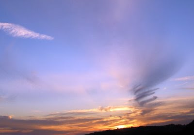
Frank Lloyd Wright died fifty years today(09 april 09). To mark it, a great Guggenheim swirl in the sky.

image & passage from:
http://edwardlifson.blogspot.com/2009/04/guggenheim-in-sky.html


posted by midori mizu

Apr 10, 2009

Funny 3D Perspective


Look what I’ve found – perspective image of the proposed Kuala Lumpur IT Hub. This is by far the funniest perspective on planet earth. Either the guy behind this perspective is a hardcore gamer or the marketing guy is.

Its dooms day and we’re on planet mars with 2 visible moons. Japanese Gundam flying in mid air with a spaceship hovering over the a futuristic building. It’s a very tasty perspective.

image & passge from:
http://www.blogger.com/post-create.g?blogID=8852607423259912908


posted by midori mizu

Apr 6, 2009

World’s largest eco bag unveiled


THE world’s largest eco bag was unveiled in front of awe-struck spectators during the launch of Kuala Lumpur Design Week 2009 (KLDW 09) at KL Tower recently. As part of the event’s aim to make a difference in Malaysia’s creative economy, the bag made it into the Guinness Book of World Records, enhancing Malaysia’s name globally.(to find out more..)

image & passage from:
http://thestar.com.my/metro/story.asp?file=/2009/4/6/central/3582894&sec=central


posted by midori mizu

Apr 5, 2009

Zamet Centre - 3LHD


The primary characteristic of the design of Zamet Centre is the integration of a big work project into the urban structure of this part of the town of Rijeka, with the objective of minimizing disruption and to evaluate its given urban conditions – unleveled terrain, the pedestrian link in a north-south direction, the quality plateau in front of the primary school, the park zone, placing the program in the centre of Zamet at the intersection of communications.
The joint conceptual and design element of the handball hall and the Zamet Centre are ‘ribbons’ stretching in a north-south direction, simultaneously functioning as an architectural design element of the objects and as a zoning element which forms a public square and a link between the north – park-school and the south – the street. One third of the hall’s volume is built into the terrain, and the building with its public and service facilities has been completely integrated into the terrain, i.e. it creates it with its ‘ribbons’.
(to find out more..)


passage & images from: http://www.worldarchitecturenews.com/index.php?fuseaction=wanappln.projectview&upload_id=11095

posted by afterrabbit

Apr 1, 2009

Serpentine Gallery Pavilion 2009 by SANAA


Japanese architects SANAA revealed their design for this year’s Serpentine Gallery Pavilion yesterday.The structure will consist of an aluminium canopy, reflecting the surrounding park.It will open in July and remain in place until October. This is the ninth in the gallery’s annual series of pavilions.

image & passage from:
http://www.dezeen.com/2009/04/01/serpentine-gallery-pavilion-by-sanaa/#more-27462


posted by midori mizu

DATUM:KL 2009

Basic Design: The New Intelligence?
3 & 4 JULY 2009
Kuala Lumpur Convention Centre

Amid all the current architectural conformity, we still find amazement in the simple,
calm in the unselfconscious. We still understand the value of the simplest fundamentals,
which, when wielded with intelligence and the integrity of process, produces remarkable
work: we understand the importance of getting back to basics.

It is time to be less consumptive and more inventive, to do more with less.

The thread of continuity which runs through DATUM:KL 2009 concerns the relevant, the
elegance of basic design, a time for reflection and a reassessment of those intrinsic
values we as architects apply to our work.


posted by s-uper-chii
 

free hit counter

Creative Commons License
This work is licensed under a Creative Commons Attribution-Noncommercial 2.5 Malaysia License.

@2010 DeArasis. SOME RIGHTS RESERVED.